
This chapter describes the different input types for the <input> element.
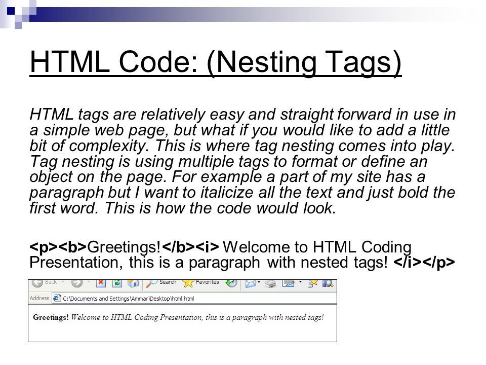
Input Type Text
<input type="text"> defines a one-line text input field:
Example
This is how the HTML code above will be displayed in a browser:

Input Type Password
<input type="password"> defines a password field:
Example
Input Type Submit
<input type="submit"> defines a button for submitting form data to a form-handler.
The form-handler is typically a server page with a script for processing input data.
The form-handler is specified in the form’s action attribute:
Example
If you omit the submit button’s value attribute, the button will get a default text:
Example
Input Type Reset
<input type="reset"> defines a reset button that will reset all form values to their default values:
Example
Input Type Radio
<input type="radio"> defines a radio button.
Radio buttons let a user select ONLY ONE of a limited number of choices:
Example
Input Type Checkbox
<input type="checkbox"> defines a checkbox.
Checkboxes let a user select ZERO or MORE options of a limited number of choices.
Example
This is how the HTML code above will be displayed in a browser:
I have a bike
I have a car
Input Type Button
<input type="button"> defines a button:
Example
HTML5 Input Types
HTML5 added several new input types:
- color
- date
- datetime-local
- month
- number
- range
- search
- tel
- time
- url
- week
New input types that are not supported by older web browsers, will behave as <input type="text">.
Input Type Color
The <input type="color"> is used for input fields that should contain a color.
Depending on browser support, a color picker can show up in the input field.
Example
Input Type Date
The <input type="date"> is used for input fields that should contain a date.
Depending on browser support, a date picker can show up in the input field.
Example
Input Type Datetime-local
The <input type="datetime-local"> specifies a date and time input field, with no time zone.
Depending on browser support, a date picker can show up in the input field.
Example
Input Type Email
The <input type="email"> is used for input fields that should contain an e-mail address.
Depending on browser support, the e-mail address can be automatically validated when submitted.
Some smartphones recognize the email type, and adds “.com” to the keyboard to match email input.
Example
Input Type File
The <input type="file"> defines a file-select field and a “Browse” button for file uploads.
Example
Input Type Month
The <input type="month"> allows the user to select a month and year.
Depending on browser support, a date picker can show up in the input field.
Example
Input Type Number
The <input type="number"> defines a numeric input field.
You can also set restrictions on what numbers are accepted.
The following example displays a numeric input field, where you can enter a value from 1 to 5:
Example
Input Restrictions
Here is a list of some common input restrictions (some are new in HTML5):
| Attribute | Description |
|---|---|
| disabled | Specifies that an input field should be disabled |
| max | Specifies the maximum value for an input field |
| maxlength | Specifies the maximum number of character for an input field |
| min | Specifies the minimum value for an input field |
| pattern | Specifies a regular expression to check the input value against |
| readonly | Specifies that an input field is read only (cannot be changed) |
| required | Specifies that an input field is required (must be filled out) |
| size | Specifies the width (in characters) of an input field |
| step | Specifies the legal number intervals for an input field |
| value | Specifies the default value for an input field |
You will learn more about input restrictions in the next chapter.
The following example displays a numeric input field, where you can enter a value from 0 to 100, in steps of 10. The default value is 30:
Example
Input Type Range
The <input type="range"> defines a control for entering a number whose exact value is not important (like a slider control). Default range is 0 to 100. However, you can set restrictions on what numbers are accepted with the min, max, and step attributes:
Example
Input Type Search
The <input type="search"> is used for search fields (a search field behaves like a regular text field).
Example
Input Type Tel
The <input type="tel"> is used for input fields that should contain a telephone number.
Note: The tel type is currently only supported in Safari 8.
Example
Input Type Time
The <input type="time"> allows the user to select a time (no time zone).
Depending on browser support, a time picker can show up in the input field.
Example
<pre><form>
 Select a time:
 <input type="time" name="usr_time">
</form></pre>
Input Type Url
The <input type="url"> is used for input fields that should contain a URL address.
Depending on browser support, the url field can be automatically validated when submitted.
Some smartphones recognize the url type, and adds “.com” to the keyboard to match url input.
Example
Input Type Week
The <input type="week"> allows the user to select a week and year.
Depending on browser support, a date picker can show up in the input field.


Leave A Comment