
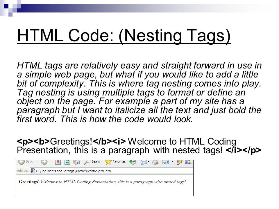
HTML Input Attributes
The value Attribute
The value attribute specifies the initial value for an input field:
Example
The readonly Attribute
The readonly attribute specifies that the input field is read only (cannot be changed):
Example
The disabled Attribute
The disabled attribute specifies that the input field is disabled.
A disabled input field is unusable and un-clickable, and its value will not be sent when submitting the form:
Example
The size Attribute
The size attribute specifies the size (in characters) for the input field:
Example
The maxlength Attribute
The maxlength attribute specifies the maximum allowed length for the input field:
Example
With a maxlength attribute, the input field will not accept more than the allowed number of characters.
The maxlength attribute does not provide any feedback. If you want to alert the user, you must write JavaScript code.
Note: Input restrictions are not foolproof, and JavaScript provides many ways to add illegal input. To safely restrict input, it must be checked by the receiver (the server) as well!
HTML5 Attributes
HTML5 added the following attributes for <input>:
- autocomplete
- autofocus
- form
- formaction
- formenctype
- formmethod
- formnovalidate
- formtarget
- height and width
- list
- min and max
- multiple
- pattern (regexp)
- placeholder
- required
- step
and the following attributes for <form>:
- autocomplete
- novalidate
The autocomplete Attribute
The autocomplete attribute specifies whether a form or input field should have autocomplete on or off.
When autocomplete is on, the browser automatically completes the input values based on values that the user has entered before.
Tip: It is possible to have autocomplete “on” for the form, and “off” for specific input fields, or vice versa.
The autocomplete attribute works with <form> and the following <input> types: text, search, url, tel, email, password, datepickers, range, and color.
Example
An HTML form with autocomplete on (and off for one input field):
Tip: In some browsers you may need to activate the autocomplete function for this to work.
The novalidate Attribute
The novalidate attribute is a <form> attribute.
When present, novalidate specifies that the form data should not be validated when submitted.
Example
Indicates that the form is not to be validated on submit:
The autofocus Attribute
The autofocus attribute specifies that the input field should automatically get focus when the page loads.
Example
Let the “First name” input field automatically get focus when the page loads:
First name:
The form Attribute
The form attribute specifies one or more forms an <input> element belongs to.
Tip: To refer to more than one form, use a space-separated list of form ids.
Example
An input field located outside the HTML form (but still a part of the form):
Last name:
The formaction Attribute
The formaction attribute specifies the URL of a file that will process the input control when the form is submitted.
The formaction attribute overrides the action attribute of the <form> element.
The formaction attribute is used with type="submit" and type="image".
Example
An HTML form with two submit buttons, with different actions:
The formenctype Attribute
The formenctype attribute specifies how the form data should be encoded when submitted (only for forms with method=”post”).
The formenctype attribute overrides the enctype attribute of the <form> element.
The formenctype attribute is used with type="submit" and type="image".
Example
Send form-data that is default encoded (the first submit button), and encoded as “multipart/form-data” (the second submit button):
The formmethod Attribute
The formmethod attribute defines the HTTP method for sending form-data to the action URL.
The formmethod attribute overrides the method attribute of the <form> element.
The formmethod attribute can be used with type="submit" and type="image".
Example
The second submit button overrides the HTTP method of the form:
The formnovalidate Attribute
The formnovalidate attribute overrides the novalidate attribute of the <form> element.
The formnovalidate attribute can be used with type="submit".
Example
A form with two submit buttons (with and without validation):
<pre><form action=”/action_page.php”>
E-mail: <input type=”email” name=”userid”><br>
<input type=”submit” value=”Submit”><br>
<input type=”submit” formnovalidate value=”Submit without validation”>
</form></pre>
The formtarget Attribute
The formtarget attribute specifies a name or a keyword that indicates where to display the response that is received after submitting the form.
The formtarget attribute overrides the target attribute of the <form> element.
The formtarget attribute can be used with type="submit" and type="image".
Example
A form with two submit buttons, with different target windows:
<pre><form action=”/action_page.php”>
First name: <input type=”text” name=”fname”><br>
Last name: <input type=”text” name=”lname”><br>
<input type=”submit” value=”Submit as normal”>
<input type=”submit” formtarget=”_blank”
value=”Submit to a new window”>
</form></pre>
The height and width Attributes
The height and width attributes specify the height and width of an <input type="image"> element.
Always specify the size of images. If the browser does not know the size, the page will flicker while images load.
Example
Define an image as the submit button, with height and width attributes:
<pre><input type=”image” src=”img_submit.gif” alt=”Submit” width=”48″ height=”48″></pre>
The list Attribute
The list attribute refers to a <datalist> element that contains pre-defined options for an <input> element.
Example
An <input> element with pre-defined values in a <datalist>:
<pre><input list=”browsers”>
<datalist id=”browsers”>
<option value=”Internet Explorer”>
<option value=”Firefox”>
<option value=”Chrome”>
<option value=”Opera”>
<option value=”Safari”>
</datalist></pre>
The min and max Attributes
The min and max attributes specify the minimum and maximum values for an <input> element.
The min and max attributes work with the following input types: number, range, date, datetime-local, month, time and week.
Example
<input> elements with min and max values:
<pre>Enter a date before 1980-01-01:
<input type=”date” name=”bday” max=”1979-12-31″>
Enter a date after 2000-01-01:
<input type=”date” name=”bday” min=”2000-01-02″>
Quantity (between 1 and 5):
<input type=”number” name=”quantity” min=”1″ max=”5″></pre>
The multiple Attribute
The multiple attribute specifies that the user is allowed to enter more than one value in the <input> element.
The multiple attribute works with the following input types: email, and file.
Example
A file upload field that accepts multiple values:
<pre>Select images: <input type=”file” name=”img” multiple></pre>
The pattern Attribute
The pattern attribute specifies a regular expression that the <input> element’s value is checked against.
The pattern attribute works with the following input types: text, search, url, tel, email, and password.
Tip: Use the global title attribute to describe the pattern to help the user.
Tip: Learn more about regular expressions in our JavaScript tutorial.
Example
An input field that can contain only three letters (no numbers or special characters):
<pre>Country code: <input type=”text” name=”country_code” pattern=”[A-Za-z]{3}” title=”Three letter country code”></pre>
The placeholder Attribute
The placeholder attribute specifies a hint that describes the expected value of an input field (a sample value or a short description of the format).
The hint is displayed in the input field before the user enters a value.
The placeholder attribute works with the following input types: text, search, url, tel, email, and password.
Example
An input field with a placeholder text:
<pre><input type=”text” name=”fname” placeholder=”First name”></pre>
The required Attribute
The required attribute specifies that an input field must be filled out before submitting the form.
The required attribute works with the following input types: text, search, url, tel, email, password, date pickers, number, checkbox, radio, and file.
Example
A required input field:
Username:
The step Attribute
The step attribute specifies the legal number intervals for an <input> element.
Example: if step=”3″, legal numbers could be -3, 0, 3, 6, etc.
Tip: The step attribute can be used together with the max and min attributes to create a range of legal values.
The step attribute works with the following input types: number, range, date, datetime-local, month, time and week.
Example
An input field with a specified legal number intervals:


Leave A Comment