
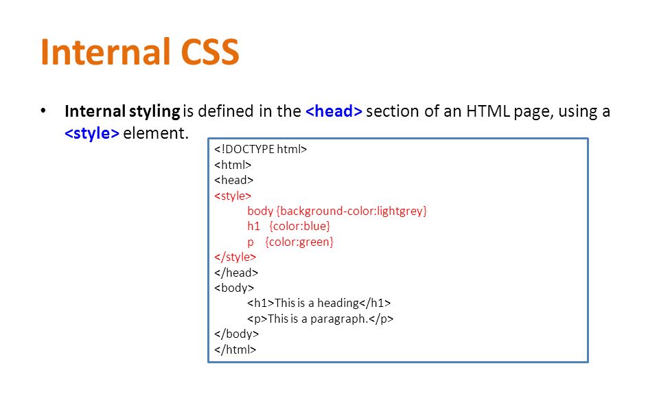
What is a Media Query?
Media query is a CSS technique introduced in CSS3.
It uses the @media rule to include a block of CSS properties only if a certain condition is true.
Example
If the browser window is 600px or smaller, the background color will be lightblue:
@media only screen and (max-width: 600px) {
    body {
        background-color: lightblue;
    }
}
Add a Breakpoint
Earlier in this tutorial we made a web page with rows and columns, and it was responsive, but it did not look good on a small screen.
Media queries can help with that. We can add a breakpoint where certain parts of the design will behave differently on each side of the breakpoint.

Use a media query to add a breakpoint at 768px:
Example
When the screen (browser window) gets smaller than 768px, each column should have a width of 100%:
/* For desktop: */
.col-1 {width: 8.33%;}
.col-2 {width: 16.66%;}
.col-3 {width: 25%;}
.col-4 {width: 33.33%;}
.col-5 {width: 41.66%;}
.col-6 {width: 50%;}
.col-7 {width: 58.33%;}
.col-8 {width: 66.66%;}
.col-9 {width: 75%;}
.col-10 {width: 83.33%;}
.col-11 {width: 91.66%;}
.col-12 {width: 100%;}

@media only screen and (max-width: 768px) {
    /* For mobile phones: */
    [class*="col-"] {
        width: 100%;
    }
}
Always Design for Mobile First
Mobile First means designing for mobile before designing for desktop or any other device (This will make the page display faster on smaller devices).
This means that we must make some changes in our CSS.
Instead of changing styles when the width gets smaller than 768px, we should change the design when the width gets larger than 768px. This will make our design Mobile First:
Example
/* For mobile phones: */
[class*="col-"] {
    width: 100%;
}
@media only screen and (min-width: 768px) {
    /* For desktop: */
    .col-1 {width: 8.33%;}
    .col-2 {width: 16.66%;}
    .col-3 {width: 25%;}
    .col-4 {width: 33.33%;}
    .col-5 {width: 41.66%;}
    .col-6 {width: 50%;}
    .col-7 {width: 58.33%;}
    .col-8 {width: 66.66%;}
    .col-9 {width: 75%;}
    .col-10 {width: 83.33%;}
    .col-11 {width: 91.66%;}
    .col-12 {width: 100%;}
}
Another Breakpoint
You can add as many breakpoints as you like.
We will also insert a breakpoint between tablets and mobile phones.

We do this by adding one more media query (at 600px), and a set of new classes for devices larger than 600px (but smaller than 768px):
Example
Note that the two sets of classes are almost identical, the only difference is the name (col- and col-s-):
/* For mobile phones: */
[class*="col-"] {
    width: 100%;
}
@media only screen and (min-width: 600px) {
    /* For tablets: */
    .col-s-1 {width: 8.33%;}
    .col-s-2 {width: 16.66%;}
    .col-s-3 {width: 25%;}
    .col-s-4 {width: 33.33%;}
    .col-s-5 {width: 41.66%;}
    .col-s-6 {width: 50%;}
    .col-s-7 {width: 58.33%;}
    .col-s-8 {width: 66.66%;}
    .col-s-9 {width: 75%;}
    .col-s-10 {width: 83.33%;}
    .col-s-11 {width: 91.66%;}
    .col-s-12 {width: 100%;}
}
@media only screen and (min-width: 768px) {
    /* For desktop: */
    .col-1 {width: 8.33%;}
    .col-2 {width: 16.66%;}
    .col-3 {width: 25%;}
    .col-4 {width: 33.33%;}
    .col-5 {width: 41.66%;}
    .col-6 {width: 50%;}
    .col-7 {width: 58.33%;}
    .col-8 {width: 66.66%;}
    .col-9 {width: 75%;}
    .col-10 {width: 83.33%;}
    .col-11 {width: 91.66%;}
    .col-12 {width: 100%;}
}
It might seem odd that we have two sets of identical classes, but it gives us the opportunity in HTML, to decide what will happen with the columns at each breakpoint:
HTML Example
For desktop:
The first and the third section will both span 3 columns each. The middle section will span 6 columns.
For tablets:
The first section will span 3 columns, the second will span 9, and the third section will be displayed below the first two sections, and it will span 12 columns:


Leave A Comment