CSS Transitions
CSS transitions allows you to change property values smoothly (from one value to another), over a given duration.
Example: Mouse over the element below to see a CSS transition effect:
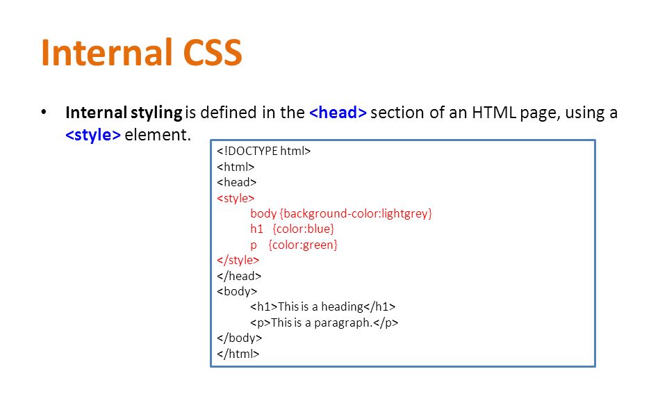
How to Use CSS Transitions?
To create a transition effect, you must specify two things:
- the CSS property you want to add an effect to
- the duration of the effect
Note: If the duration part is not specified, the transition will have no effect, because the default value is 0.
The following example shows a 100px * 100px red <div> element. The <div> element has also specified a transition effect for the width property, with a duration of 2 seconds:
Example
div {
    width: 100px;
    height: 100px;
    background: red;
    -webkit-transition: width 2s; /* Safari */
    transition: width 2s;
}
The transition effect will start when the specified CSS property (width) changes value.
Now, let us specify a new value for the width property when a user mouses over the <div> element:
Example
div:hover {
    width: 300px;
}
Notice that when the cursor mouses out of the element, it will gradually change back to its original style.
Change Several Property Values
The following example adds a transition effect for both the width and height property, with a duration of 2 seconds for the width and 4 seconds for the height:
Example
div {
    -webkit-transition: width 2s, height 4s; /* Safari */
    transition: width 2s, height 4s;
}
Specify the Speed Curve of the Transition
The transition-timing-function property specifies the speed curve of the transition effect.
The transition-timing-function property can have the following values:
ease– specifies a transition effect with a slow start, then fast, then end slowly (this is default)linear– specifies a transition effect with the same speed from start to endease-in– specifies a transition effect with a slow startease-out– specifies a transition effect with a slow endease-in-out– specifies a transition effect with a slow start and endcubic-bezier(n,n,n,n)– lets you define your own values in a cubic-bezier function
The following example shows the some of the different speed curves that can be used:
Example
#div1 {transition-timing-function: linear;}
#div2 {transition-timing-function: ease;}
#div3 {transition-timing-function: ease-in;}
#div4 {transition-timing-function: ease-out;}
#div5 {transition-timing-function: ease-in-out;}
Delay the Transition Effect
The transition-delay property specifies a delay (in seconds) for the transition effect.
The following example has a 1 second delay before starting:
Example
div {
    -webkit-transition-delay: 1s; /* Safari */
    transition-delay: 1s;
}
Transition + Transformation
The following example also adds a transformation to the transition effect:
Example
div {
    -webkit-transition: width 2s, height 2s, -webkit-transform 2s; /* Safari */
    transition: width 2s, height 2s, transform 2s;
}
More Transition Examples
The CSS transition properties can be specified one by one, like this:
Example
div {
    transition-property: width;
    transition-duration: 2s;
    transition-timing-function: linear;
    transition-delay: 1s;
}
or by using the shorthand property transition:
Example
div {
    transition: width 2s linear 1s;
}


Leave A Comment