
Learn how to style images using CSS.
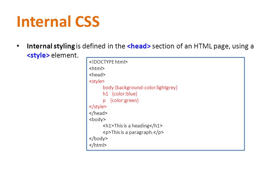
Rounded Images
Use the border-radius property to create rounded images:

Example
Rounded Image:
img {
    border-radius: 8px;
}
Example
Circled Image:
img {
    border-radius: 50%;
}
Thumbnail Images
Use the border property to create thumbnail images.
Thumbnail Image:
Example
img {
    border: 1px solid #ddd;
    border-radius: 4px;
    padding: 5px;
    width: 150px;
}

Thumbnail Image as Link:
Example
img {
    border: 1px solid #ddd;
    border-radius: 4px;
    padding: 5px;
    width: 150px;
}

img:hover {
    box-shadow: 0 0 2px 1px rgba(0, 140, 186, 0.5);
}
Responsive Images
Responsive images will automatically adjust to fit the size of the screen.
Resize the browser window to see the effect:
If you want an image to scale down if it has to, but never scale up to be larger than its original size, add the following:
Example
img {
    max-width: 100%;
    height: auto;
}
Tip: Read more about Responsive Web Design in our CSS RWD Tutorial.
Center an Image
To center an image, set left and right margin to auto and make it into a block element:
Example
img {
    display: block;
    margin-left: auto;
    margin-right: auto;
    width: 50%;
}
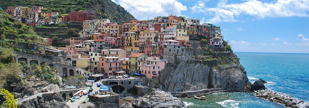
Polaroid Images / Cards
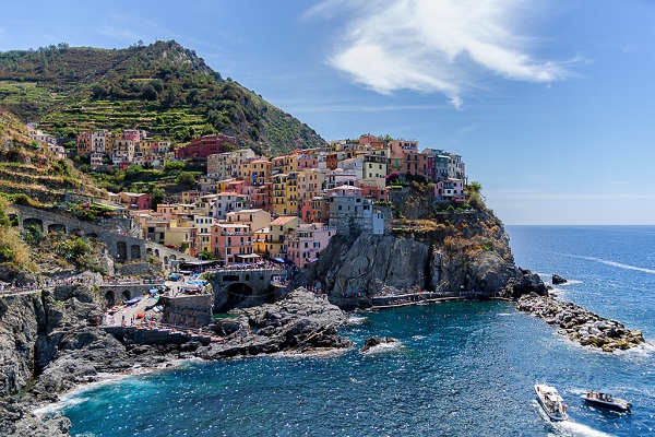
Cinque Terre

Northern Lights
Example
div.polaroid {
    width: 80%;
    background-color: white;
    box-shadow: 0 4px 8px 0 rgba(0, 0, 0, 0.2), 0 6px 20px 0 rgba(0, 0, 0, 0.19);
}

img {width: 100%}

div.container {
    text-align: center;
    padding: 10px 20px;
}
Transparent Image
The opacity property can take a value from 0.0 – 1.0. The lower value, the more transparent:

opacity 0.2
opacity 0.5
opacity 1
(default)
Note: IE8 and earlier use filter:alpha(opacity=x). The x can take a value from 0 – 100. A lower value makes the element more transparent.
Example
img {
    opacity: 0.5;
    filter: alpha(opacity=50); /* For IE8 and earlier */
}
Image Text
How to position text in an image:
Example
Try it Yourself:
Top Left » Top Right » Bottom Left » Bottom Right » Centered »
Image Filters
The CSS filter property adds visual effects (like blur and saturation) to an element.
Note: The filter property is not supported in Internet Explorer, Edge 12, or Safari 5.1 and earlier.
Example
Change the color of all images to black and white (100% gray):
img {

    -webkit-filter: grayscale(100%); /* Safari 6.0 – 9.0 */

    filter: grayscale(100%);

}
Note: The filter property is not supported in Internet Explorer, Edge 12, or Safari 5.1 and earlier.

Tip: Go to our CSS filter Reference to learn more about CSS filters.
Image Hover Overlay
Create an overlay effect on hover:
Example
Fade in text:
Example
Fade in a box:
Example
Slide in (top):
Example
Slide in (bottom):
Example
Slide in (left):
Example
Slide in (right):
Flip an Image
Move your mouse over the image:
Example
img:hover {
    -webkit-transform: scaleX(-1);
    transform: scaleX(-1);
}
Responsive Image Gallery
CSS can be used to create image galleries. This example use media queries to re-arrange the images on different screen sizes. Resize the browser window to see the effect:


Example
.responsive {
    padding: 0 6px;
    float: left;
    width: 24.99999%;
}

@media only screen and (max-width: 700px){
    .responsive {
        width: 49.99999%;
        margin: 6px 0;
    }
}

@media only screen and (max-width: 500px){
    .responsive {
        width: 100%;
    }
}
Tip: Read more about Responsive Web Design in our CSS RWD Tutorial.
Image Modal (Advanced)
This is an example to demonstrate how CSS and JavaScript can work together.
First, use CSS to create a modal window (dialog box), and hide it by default.
Then, use a JavaScript to show the modal window and to display the image inside the modal, when a user clicks on the image:
Example
// Get the modal
var modal = document.getElementById('myModal');

// Get the image and insert it inside the modal - use its "alt" text as a caption
var img = document.getElementById('myImg');
var modalImg = document.getElementById("img01");
var captionText = document.getElementById("caption");
img.onclick = function(){
    modal.style.display = "block";
    modalImg.src = this.src;
    captionText.innerHTML = this.alt;
}

// Get the  element that closes the modal
var span = document.getElementsByClassName("close")[0];

// When the user clicks on  (x), close the modal
span.onclick = function() {
    modal.style.display = "none";
}


Leave A Comment