
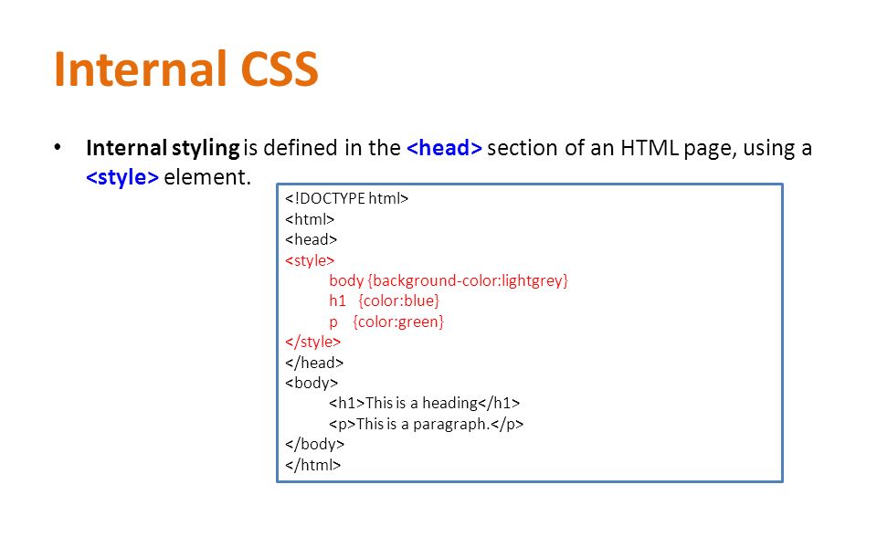
CSS Layout – width and max-width
Using width, max-width and margin: auto;
As mentioned in the previous chapter; a block-level element always takes up the full width available (stretches out to the left and right as far as it can).
Setting the width of a block-level element will prevent it from stretching out to the edges of its container. Then, you can set the margins to auto, to horizontally center the element within its container. The element will take up the specified width, and the remaining space will be split equally between the two margins:
This <div> element has a width of 500px, and margin set to auto.
Note: The problem with the <div> above occurs when the browser window is smaller than the width of the element. The browser then adds a horizontal scrollbar to the page.
Using max-width instead, in this situation, will improve the browser’s handling of small windows. This is important when making a site usable on small devices:
Tip: Resize the browser window to less than 500px wide, to see the difference between the two divs!
Here is an example of the two divs above:
Example
div.ex1 {
    width: 500px;
    margin: auto;
    border: 3px solid #73AD21;
}

div.ex2 {
    max-width: 500px;
    margin: auto;
    border: 3px solid #73AD21;
}
CSS Layout – The position Property
The position property specifies the type of positioning method used for an element (static, relative, fixed, absolute or sticky).
The position Property
The position property specifies the type of positioning method used for an element.
There are five different position values:
staticrelativefixedabsolutesticky
Elements are then positioned using the top, bottom, left, and right properties. However, these properties will not work unless the position property is set first. They also work differently depending on the position value.
position: static;
HTML elements are positioned static by default.
Static positioned elements are not affected by the top, bottom, left, and right properties.
An element with position: static; is not positioned in any special way; it is always positioned according to the normal flow of the page:
Here is the CSS that is used:
Example
div.static {
    position: static;
    border: 3px solid #73AD21;
}
position: relative;
An element with position: relative; is positioned relative to its normal position.
Setting the top, right, bottom, and left properties of a relatively-positioned element will cause it to be adjusted away from its normal position. Other content will not be adjusted to fit into any gap left by the element.
Here is the CSS that is used:
Example
div.relative {
    position: relative;
    left: 30px;
    border: 3px solid #73AD21;
}
position: fixed;
An element with position: fixed; is positioned relative to the viewport, which means it always stays in the same place even if the page is scrolled. The top, right, bottom, and left properties are used to position the element.
A fixed element does not leave a gap in the page where it would normally have been located.
Notice the fixed element in the lower-right corner of the page. Here is the CSS that is used:
Example
div.fixed {
    position: fixed;
    bottom: 0;
    right: 0;
    width: 300px;
    border: 3px solid #73AD21;
}
position: absolute;
An element with position: absolute; is positioned relative to the nearest positioned ancestor (instead of positioned relative to the viewport, like fixed).
However; if an absolute positioned element has no positioned ancestors, it uses the document body, and moves along with page scrolling.
Note: A “positioned” element is one whose position is anything except static.
Here is a simple example:
This <div> element has position: relative;
Here is the CSS that is used:
Example
div.relative {
    position: relative;
    width: 400px;
    height: 200px;
    border: 3px solid #73AD21;
}

div.absolute {
    position: absolute;
    top: 80px;
    right: 0;
    width: 200px;
    height: 100px;
    border: 3px solid #73AD21;
}
position: sticky;
An element with position: sticky; is positioned based on the user’s scroll position.
A sticky element toggles between relative and fixed, depending on the scroll position. It is positioned relative until a given offset position is met in the viewport – then it “sticks” in place (like position:fixed).
Try to scroll inside this frame to understand how sticky positioning works.
Note: IE/Edge 15 and earlier versions do not support sticky position.
Lorem ipsum dolor sit amet, illum definitiones no quo, maluisset concludaturque et eum, altera fabulas ut quo. Atqui causae gloriatur ius te, id agam omnis evertitur eum. Affert laboramus repudiandae nec et. Inciderint efficiantur his ad. Eum no molestiae voluptatibus.
Lorem ipsum dolor sit amet, illum definitiones no quo, maluisset concludaturque et eum, altera fabulas ut quo. Atqui causae gloriatur ius te, id agam omnis evertitur eum. Affert laboramus repudiandae nec et. Inciderint efficiantur his ad. Eum no molestiae voluptatibus.
Lorem ipsum dolor sit amet, illum definitiones no quo, maluisset concludaturque et eum, altera fabulas ut quo. Atqui causae gloriatur ius te, id agam omnis evertitur eum. Affert laboramus repudiandae nec et. Inciderint efficiantur his ad. Eum no molestiae voluptatibus.
Note: Internet Explorer, Edge 15 and earlier versions do not support sticky positioning. Safari requires a -webkit- prefix (see example below). You must also specify at least one of top, right, bottom or left for sticky positioning to work.
In this example, the sticky element sticks to the top of the page (top: 0), when you reach its scroll position.
Example
div.sticky {
    position: -webkit-sticky; /* Safari */
    position: sticky;
    top: 0;
    background-color: green;
    border: 2px solid #4CAF50;
}
Overlapping Elements
When elements are positioned, they can overlap other elements.
The z-index property specifies the stack order of an element (which element should be placed in front of, or behind, the others).
An element can have a positive or negative stack order:
Because the image has a z-index of -1, it will be placed behind the text.
Example
img {
    position: absolute;
    left: 0px;
    top: 0px;
    z-index: -1;
}
An element with greater stack order is always in front of an element with a lower stack order.
Note: If two positioned elements overlap without a z-index specified, the element positioned last in the HTML code will be shown on top.
Positioning Text In an Image
How to position text over an image:
Example


Leave A Comment