HTML Layouts
HTML Layout Example
Cities
London
London is the capital city of England. It is the most populous city in the United Kingdom, with a metropolitan area of over 13 million inhabitants.
Standing on the River Thames, London has been a major settlement for two millennia, its history going back to its founding by the Romans, who named it Londinium.
HTML Layout Elements
Websites often display content in multiple columns (like a magazine or newspaper).
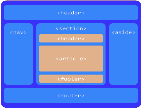
HTML5 offers new semantic elements that define the different parts of a web page:
- <header> – Defines a header for a document or a section
- <nav> – Defines a container for navigation links
- <section> – Defines a section in a document
- <article> – Defines an independent self-contained article
- <aside> – Defines content aside from the content (like a sidebar)
- <footer> – Defines a footer for a document or a section
- <details> – Defines additional details
- <summary> – Defines a heading for the <details> element

HTML Layout Techniques
There are four different ways to create multicolumn layouts. Each way has its pros and cons:
- HTML tables (not recommended)
- CSS float property
- CSS flexbox
- CSS framework
Which One to Choose?
HTML Tables
The <table> element was not designed to be a layout tool! The purpose of the <table> element is to display tabular data. So, do not use tables for your page layout! They will bring a mess into your code. And imagine how hard it will be to redesign your site after a couple of months.
Tip: Do NOT use tables for your page layout!
CSS Frameworks
If you want to create your layout fast, you can use a framework, like W3.CSS or Bootstrap.
CSS Floats
It is common to do entire web layouts using the CSS float property. Float is easy to learn – you just need to remember how the float and clear properties work. Disadvantages: Floating elements are tied to the document flow, which may harm the flexibility. Learn more about float in our CSS Float and Clear chapter.
CSS Flexbox
Flexbox is a new layout mode in CSS3.
Use of flexbox ensures that elements behave predictably when the page layout must accommodate different screen sizes and different display devices. Disadvantages: Does not work in IE10 and earlier.
Learn more about flexbox in our CSS Flexbox chapter.


Leave A Comment