The CSS arrow is used to add an array along with tooltip. It makes the tooltip like a speech bubble. It can also be represented in four ways:
- Top arrow
- Bottom arrow
- Left arrow
- Right arrow
CSS Top Arrow
The top arrow is used to add an arrow like structure on the top of the tooltip when you move your mouse cursor over the element. It will display the tooltip on the bottom of the element.
See this example:
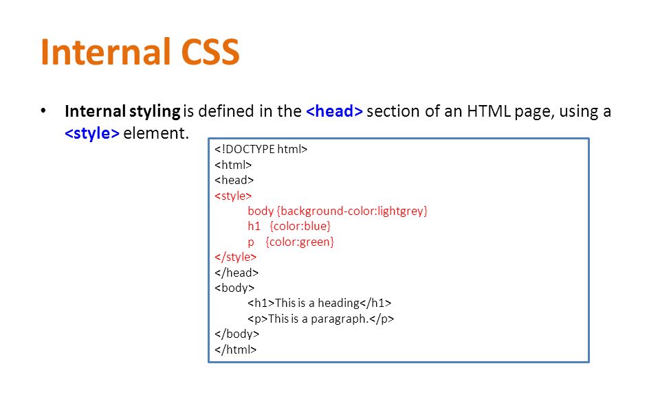
<!DOCTYPE html>
<html>
<style>
.tooltip {
position: relative;
display: inline-block;
border-bottom: 1px dotted black;
}
.tooltip .tooltiptext {
visibility: hidden;
width: 120px;
background-color: black;
color: #fff;
text-align: center;
border-radius: 6px;
padding: 5px 0;
position: absolute;
z-index: 1;
top: 150%;
left: 50%;
margin-left: -60px;
}
.tooltip .tooltiptext::after {
content: “”;
position: absolute;
bottom: 100%;
left: 50%;
margin-left: -5px;
border-width: 5px;
border-style: solid;
border-color: transparent transparent black transparent;
}
.tooltip:hover .tooltiptext {
visibility: visible;
}
</style>
<body style=“text-align:center;”>
<h2>Top Arrow Example</h2>
<p>Move your mouse cursor over the below heading</p>
<div class=“tooltip”><strong>Welcom to JavaTpoint</strong>
<span class=“tooltiptext”>A solution of all technology</span>
</div>
</body>
</html>
CSS Bottom Arrow
The bottom arrow is used to add an arrow like structure on the bottom of the tooltip when you move your mouse cursor over the element. It will display the tooltip on the top of the element.
See this example:
<!DOCTYPE html>
<html>
<style>
.tooltip {
position: relative;
display: inline-block;
border-bottom: 1px dotted black;
}
.tooltip .tooltiptext {
visibility: hidden;
width: 120px;
background-color: black;
color: #fff;
text-align: center;
border-radius: 6px;
padding: 5px 0;
position: absolute;
z-index: 1;
bottom: 150%;
left: 50%;
margin-left: -60px;
}
.tooltip .tooltiptext::after {
content: “”;
position: absolute;
top: 100%;
left: 50%;
margin-left: -5px;
border-width: 5px;
border-style: solid;
border-color: black transparent transparent transparent;
}
.tooltip:hover .tooltiptext {
visibility: visible;
}
</style>
<body style=“text-align:center;”>
<h2>Bottom Arrow Example</h2>
<p>Move your mouse cursor over the below heading</p>
<div class=“tooltip”><strong>Welcom to JavaTpoint</strong>
<span class=“tooltiptext”>A solution of all technology</span>
</div>
</body>
</html>
CSS Left Arrow
The left arrow is used to add an arrow like structure on the left of the tooltip when you move your mouse cursor over the element. It will display the tooltip on the right of the element.
See this example:
<!DOCTYPE html>
<html>
<style>
.tooltip {
position: relative;
display: inline-block;
border-bottom: 1px dotted black;
}
.tooltip .tooltiptext {
visibility: hidden;
width: 120px;
background-color: black;
color: #fff;
text-align: center;
border-radius: 6px;
padding: 5px 0;
position: absolute;
z-index: 1;
top: -5px;
left: 110%;
}
.tooltip .tooltiptext::after {
content: “”;
position: absolute;
top: 50%;
right: 100%;
margin-top: -5px;
border-width: 5px;
border-style: solid;
border-color: transparent black transparent transparent;
}
.tooltip:hover .tooltiptext {
visibility: visible;
}
</style>
<body style=“text-align:center;”>
<h2>Left Arrow Example</h2>
<p>Move your mouse cursor over the below heading</p>
<div class=“tooltip”><strong>Welcom to JavaTpoint</strong>
<span class=“tooltiptext”>A solution of all technology</span>
</div>
</body>
</html>
CSS Right Arrow
The right arrow is used to add an arrow like structure on the right of the tooltip when you move your mouse cursor over the element. It will display the tooltip on the left of the element.
See this example:
<!DOCTYPE html>
<html>
<style>
.tooltip {
position: relative;
display: inline-block;
border-bottom: 1px dotted black;
}
.tooltip .tooltiptext {
visibility: hidden;
width: 120px;
background-color: black;
color: #fff;
text-align: center;
border-radius: 6px;
padding: 5px 0;
position: absolute;
z-index: 1;
top: -5px;
right: 110%;
}
.tooltip .tooltiptext::after {
content: “”;
position: absolute;
top: 50%;
left: 100%;
margin-top: -5px;
border-width: 5px;
border-style: solid;
border-color: transparent transparent transparent black;
}
.tooltip:hover .tooltiptext {
visibility: visible;
}
</style>
<body style=“text-align:center;”>
<h2>Right Arrow Example</h2>
<p>Move your mouse cursor over the below heading</p>
<div class=“tooltip”><strong>Welcom to JavaTpoint</strong>
<span class=“tooltiptext”>A solution of all technology</span>
</div>
</body>
</html>


Leave A Comment